
I am working on a project where the design calls for a parallelogram with some content in certain places. The solution was an interesting journey and I wanted to share it with others.
End Goal
The end goal is a parallelogram like this:

Getting There
Since everything in CSS is based on rectangles, I knew that I’d be starting with a basic rectangle:
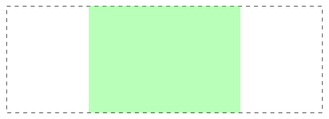
The green element is a simple, sized div and the dashed line represents a containing div that clips anything extending outside of it. Now, I need to add some elements that can be used as the side bits: 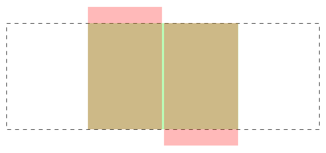
We will use the red elements for the side bits. They can be either :before and :after pseudo elements on the green div or new elements. The red elements are taller than the green and located in specific places so that they have the correct length once they are rotated into place: 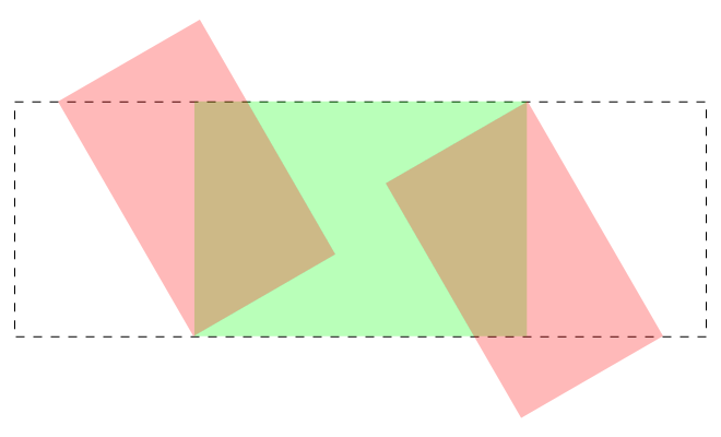 The side bits are now rotated into their correct place. You can see a working example in this pen:
See the Pen Parallelogram in CSS by Matt Vanderpol (@bookwyrm) on CodePen.
The Trigonometry
You may notice some comments in the Sass indicating that slant height and width are figured out via trigonometry. This is fairly straightforward and everything is calculated based on this diagram:
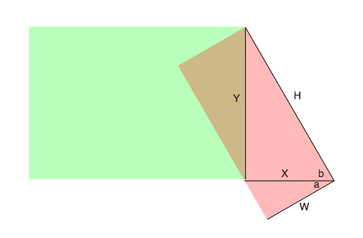
We know some of these values:
Yis the height of the parallelogram (from the design)bis 60deg (from the design)ais 30deg (because of rectangles)
We need to know H and W in order to setup the slants.
H=y/sin(60)(approximately 250)X=H*cos(60)(125)W=cos(30)/X(approximately 109)
You should round the H, X and W values up since they will get clipped and if you are short you will have a gap.
Conclusion
This is a fairly straightforward application of trigonometry and CSS to build a parallelogram with a solid fill. In a future post, I’ll go into further details on how I took this same approach and went farther to create a parallelogram that had a translucent gradient fill.